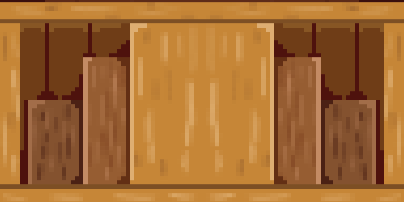
There are a number of ways to separate sections of a piece of art to create depth. The easiest is to use lines and shape language to create simple illusions of 3D depth. That's why I used that method for a game jam game somewhat recently. In the realm of Top-down gaming, this method does run into a few issues due to the fact that Top-down games are actually in some seriously nonsense perspective for the sake of objects being understandable, also, part of my style for New Dawn for the Elements involves not using black in the tiles at all, so that the character sprites (Which are always outlined with black per the style guide) always manage to stand out and be readable.
So that begs the question: How do I go about separating sections of art in order to create depth? The answer is shifting around hue and value. Now, of the two, you'd think the easier one would be value. Just an easy light-to-dark scale, right? Wrong. Remember what I said about perspective? That also applies to lighting. The light source in a game like this is just about anywhere most of the time, unless you specify the lighting, which I am not doing for New Dawn. My general policy is to gently light objects from directly above/in front (Again, the perspective thing).
This does have one more problem: Walls and floors. By my general rules, all the floors would just be darker than the wall/ceiling tiles. But, in my professional opinion, that looks ugly! So, I won't do that. What I am going to do though, is info dump about the ways I use changes in Value, Hue, and Saturation in making assets. I know that's a lame essay sort of way to segue, but screw you, it's my website!
Value changes
As stated before, this is the simple adjustment from light to dark, in a purely monochrome sense. For my tiles, I rarely use this change on its own, it tends to make things look flat, ironically. However, as a part of shadow, this comes into play when creating texture. Given the way lighting is handled (Meaning, it isn't), the only guaranteed place for shadows is in small cracks and crevises. Places like the gaps between pebbles, or between tree rings in planks of wood. This elevates the tile as a believable texture to represent a real thing. This could have been done without, but when I started making assets, I wanted them to blend with the fairly high-detail default assets of RPG Maker MV. You could easily get away with making grass simply the color green, and depending on the tone and presentation of the rest of your game, it might even be helpful to do so.
Hue shifting
This is largely used with changing value (Duh) in order to create shadows and, on occasion, highlights. There are two fairly simple rules that I use to govern what way to shift the hue: The light source is "warm colored", and the ambient light is "Cool-colored".
Believe it or not, this was a hard choice to land on, because my game has a Day-Night cycle. Ultimately, I made this choice because the time in the cycle that cooresponds to "no screen tint" is somewhere around noon on a (presumably) sunny day. In such a situation, the direct light would be coming from the sun, which is famously yellow, and so objects being hit with that direct light would reflect in a somewhat warmer tone, compared to how it may appear under a white light source such as a flourescent bulb.
The Ambient light being cold is a little more interesting. Ultimately, it's because the sky is blue. That's an wasy way to remember it. But I am autistic, so for me to understand and apply this fact, I had to understand Why the Sky is Blue. It's, generally speaking, because blue is a lower-energy wavelength of light, which makes it better at scattering as the light is interferred with by the gases in the Earth's atmosphere. in this way, shadows are very rarely "black" per se, but more likely to have something of a blueish tint to it. Assuming you're outsite and the cloud cover is somewhat minimal. Indoor situations can be radically different for both direct and ambient light, but that's a lot got get into that I don't even pa attention to. I simply act as though all of my tiles are underneath the sun sometime a little after solar noon on a sunny day, for my convenience. Like how engineers will write test questions that end with "assume there is no friction".
Saturation
This part wasn't in the title of the entry, but it's a fun footnote nevertheless. Saturation here is how close the color I've chosen gets to the white-gray-black scale, and I use it to imply depth of certain objects, in conjunction with the other two factors. Essentially, I use lower saturation to imply something is further away. In the case of the game, that would be "deeper down". My best example of this is the stair tiles I made. With each subsequent stair, the color of the stair going down became darker, more blue, and closer to gray! It's a simple trick to imply distance that I picked up watching someone else dissect old Disney movies a long time ago, and it seems to have worked!